The Washington Capitals’ new Winter Classic hockey jerseys are hot off the press release. Red, with white stars and striped shoulders, the most noticeable detail is the lack of the familiar Capitals’ logo on the front. Instead, the white letters that read “Capitals” are layered over a large navy W that reminisces images of a college sweater from the 1950s.
The sweaters are – in some aspects – supposed to be a tribute to the past, which leaves fans to contemplate jerseys past.

The Capitals’ very first Washington sweaters – for the 1974-75 season – sported a familiar color pattern of red, white and blue, all too appropriate for a team playing in the nation’s capital. The shoulders were capped with red, and stars of alternating blue and red lined the chest and sleeves.
The logo was simple. As Glenn Dreyfuss described it in his book The Legends of Landover, it was “a text-based logo, all lower case, in a custom font colored blue.” The ‘T’ in Capitals resembled a hockey stick, and the word ‘Washington’ nestled above the first three letters of the team’s name.
The next notable change to the uniform altered the size of the word ‘Washington.’ In the 1980s, trying to appeal to a broader Maryland audience, the name shrunk until it was practically illegible. Within that decade, the number of stars on the sleeve alternated slightly, but the next big change did not occur until a little more than ten years later.
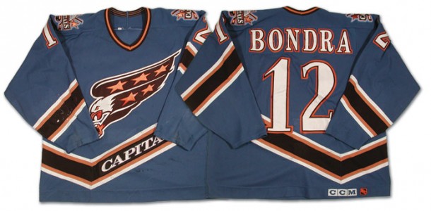
Starting in the 1995-96 season, the Washington Capitals’ wore a bold new uniform. It featured a color scheme of black, bronze and lighter blue. The logo changed to show the profile of an eagle, talons extended and stars in its wings. “The new design is intended to give the team a more aggressive presence on the ice, while keeping some of the patriotic elements of the old uniforms,” Jason LaCanfora said in an article published in The Baltimore Sun on June 23, 1995.
The team’s home jerseys were white, as was the standard then for the National Hockey League, and their away jerseys were lighter blue. Small changes were made in the following years. The home jerseys dropped the team name from their design in 1997.

According to the Official Home of the Washington Capitals, capitals.nhl.com, “A black third jersey is added and is worn for the first time Jan. 25, 1998.” These black jerseys sported what had previously been the team’s alternate logo. It featured the dome of the Capitol building flanked by two hockey sticks and two stars. Between the two sticks sat a puck. Under the dome a box displayed the words “Washington Capitals.”
After two subsequent seasons, the team discontinued the light blue jerseys and only wore the black jerseys on the road. They became the home jerseys for the Capitals when the NHL changed the rules in 2003. Many theories suggested the reasoning behind the change. According to a study published in 2011, “When teams switched to wearing colored jerseys at home games, they were penalized more than when they wore white jerseys at home games.” If the referees called more penalties on players wearing black, it could prevent or at least counterbalance biases when calling penalties in front of a team’s home crowd, however this is not confirmed by the NHL.
The Washington Capitals’ sweaters changed most recently in 2007, when the team unveiled their newest uniforms. While more modern than their outfits from the 1970s and 80s, the design once again featured a text based logo, and the traditional American flag color scheme.

The logo on the Capitals’ current jerseys may resemble the inaugural logo, but it is not identical. The font underwent the most dramatic change. “The letters lean forward, representing the team’s commitment to innovation and forward thinking,” the Capitals’ website said. It also boasts only three stars, to represent the three primary geographic areas – Maryland, D.C. and Virginia – supporting the Washington hockey team.
Perhaps the biggest change to the newest sweaters, compared to those of the older days was the alternate logo, found on each shoulder. This logo features a red and blue eagle, with its wings spread to make the shape of a W, to stand for Washington. Silhouetted within the eagle is the dome of the U.S. Capitol Building.
The new Winter Classic sweaters may evoke memories of the past, or inspire ideas for the future. They include elements used by the Capitals over the past almost forty years, and brand new elements as well. Regardless of when the team changes their uniform again, or what it will look like when they do, the 2014-15 season’s Winter Classic jerseys added to the already rich history of the Washington Capitals’ uniforms.
More: That Time When the Capitals’ Old Jerseys Were New, via Japers Rink